Back in October I explained how badly my first attempt at data journalism went.
I said that I wanted to look back on this later and explain what I should have done.
What went wrong?

My initial FOI request.
I originally wanted to map the accidents, to find out which roads were the most dangerous.
It’s now obvious to me that I should have asked for better location data.
I asked for the road and area in which each accident happened, thinking that this would make it easier to map.
But the response I got returned everything in a single column, with inconsistent formatting. For example, sometimes “Road” would be used, and other times “Rd”.
Even if I were to clean it up a bit, many of the accidents took place at junctions and Google maps wouldn’t be able to make sense when two road names are used to show which junction it was.

A screenshot from the PDF format Thames Valley Police used to send me the data
It would have been much simpler to ask for the longitude and latitude, which police record for every incident.
This would have made plotting the accidents on a map a painless process, and then I could have looked at which areas were attracting the most.
Vehicles involved in accidents
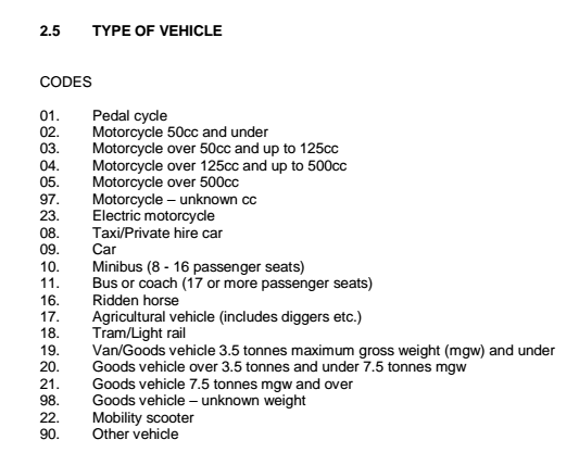
The vehicle codes used by Thames Valley Police.
My other post mentioned that I spent time changing each entry’s vehicle information to “make it usable”.
What this meant is that I use the list of codes I received with my FOI to change the vehicle type column into words. So, for example, “16 9 16 16” was changed to “One car, three ridden horses”.
Essentially, I made the data much less usable, and spent hours doing so manually.
It would have been good to use in an info box if my mapping plan had worked, but it essentially prevented me from analysing the numbers.
Determined to at least salvage something from this dataset, I’ve worked out how to use this column to chart how many accidents each vehicle type is involved in.
Since I know what each number represents, I just had to count the total. To do this I used the “Text to columns” feature in Excel to split the column wherever there was a space.
This meant that every number now had its own individual cell.
From here I just had to use the “=COUNTIF” function to see how often each number appeared. A few from the list did not appear, so I removed them. I also decided to combine some of the similar vehicles, so for example, I combined the different “motorcycle” totals into one.
This left me with the following, simple dataset:
| Vechicle | Total involved in accidents |
| Bicycle | 164 |
| Motorcycle | 119 |
| Taxi | 34 |
| Car | 1637 |
| Bus/Coach | 9 |
| Horse | 3 |
| Goods Vehicle | 84 |
I then used Datawrapper to make a quick chart out of it:

Click the image for the slightly more interactive version.
Hardly shocking stuff, but it is something I was able to do very quickly and with none of the struggles I had when I first tackled the dataset.
I would also like to try breaking down the data using the time of each accident, to see which time periods are the most dangerous to be on the road at.
For now though, I’m just relieved to have at least made a small achievement using this data.
